Launching a new product is always a challenge, because everything rests on the first connection between the customer and the brand.
When a product is new, there is no familiarity to lean on, no prior designs people recognise, no presence on TV or any other channel that has already done the work of introducing it. The design has to carry that introduction on its own. It has to show, in seconds, that this is a new product worth paying attention to, that it is considered, credible, and compelling enough to try. For Dote, that meant every first impression had to earn trust before a single word was read. On top of that, the challenge was never a single deliverable; it was coherence across very different formats and audiences. Dote needed to land on a physical shelf in Target, perform on Amazon, convince investors in a pitch deck, and feel native inside the App Store and Google Play, all at the same time. Each of these surfaces has its own rules, its own competitive context, and its own moment of attention. Packaging has seconds to communicate in a noisy aisle. Amazon listings live and die on the first three images. App store artwork has to summarise an entire product at thumbnail size. A pitch deck has to build credibility within the first few slides. Working closely with the Dote team, we recognised that holding all of this together would require more than producing assets in isolation. It demanded a marketing system that extended the existing brand guidelines, raised the visual bar across every touchpoint, and gave Dote the confidence to enter the market with a single, recognisable identity.
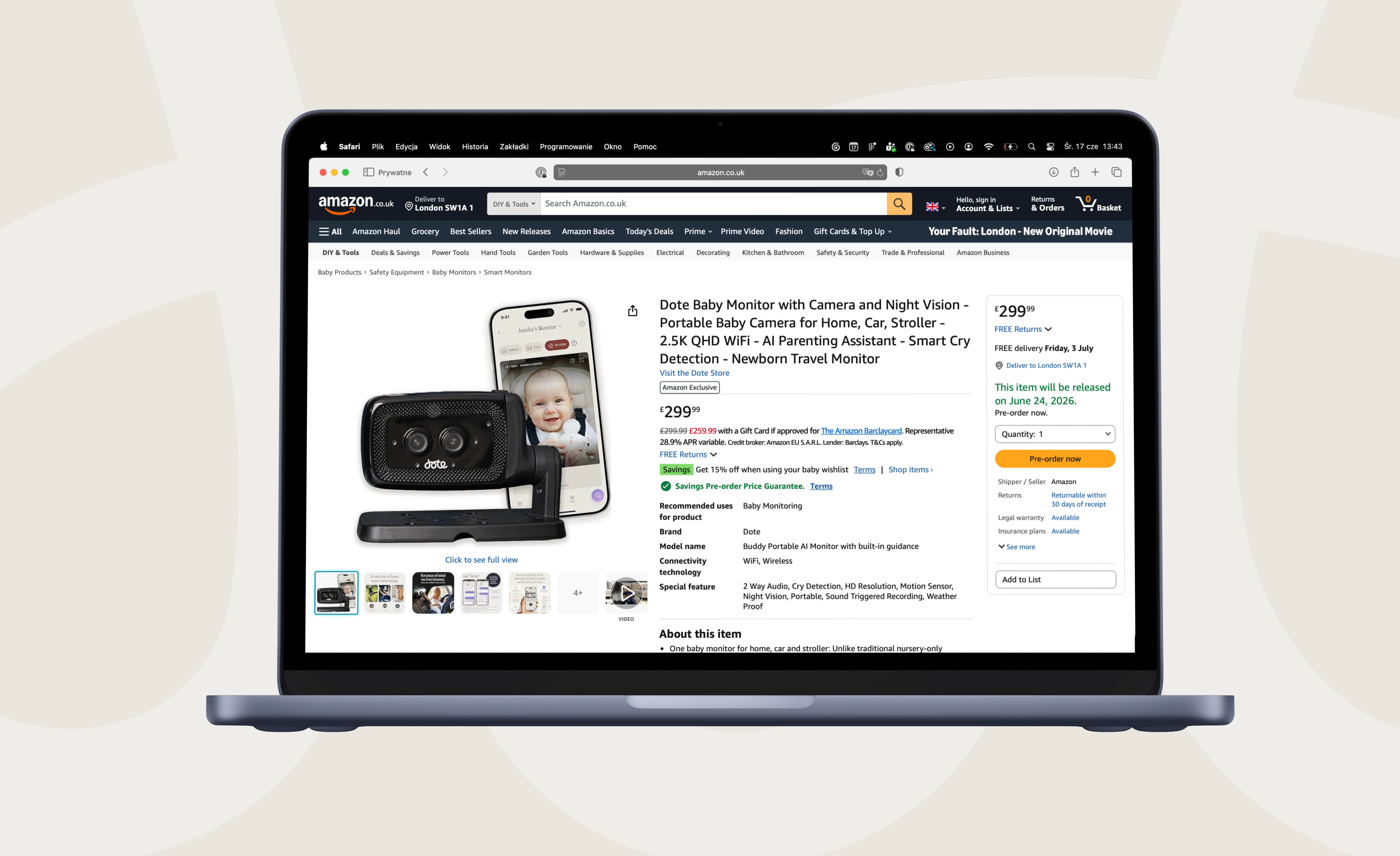
We partnered with Dote on a full marketing design programme covering everything a customer or investor would see outside the app, and the scope grew steadily as the relationship deepened.
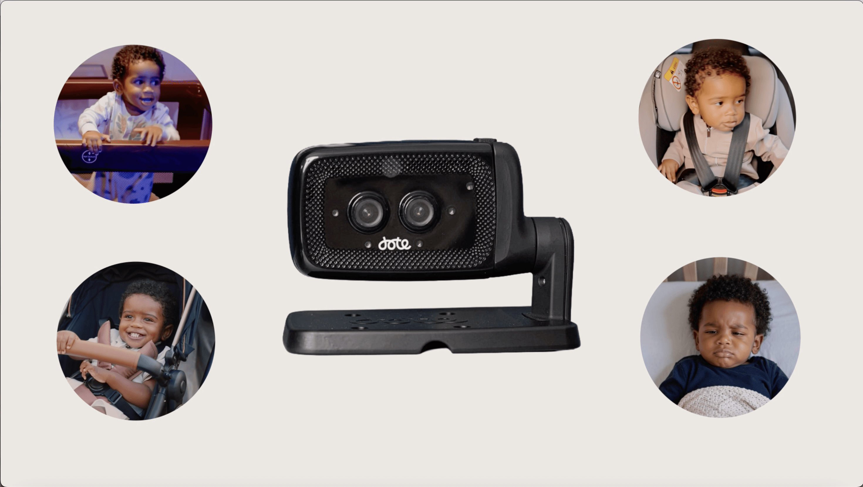
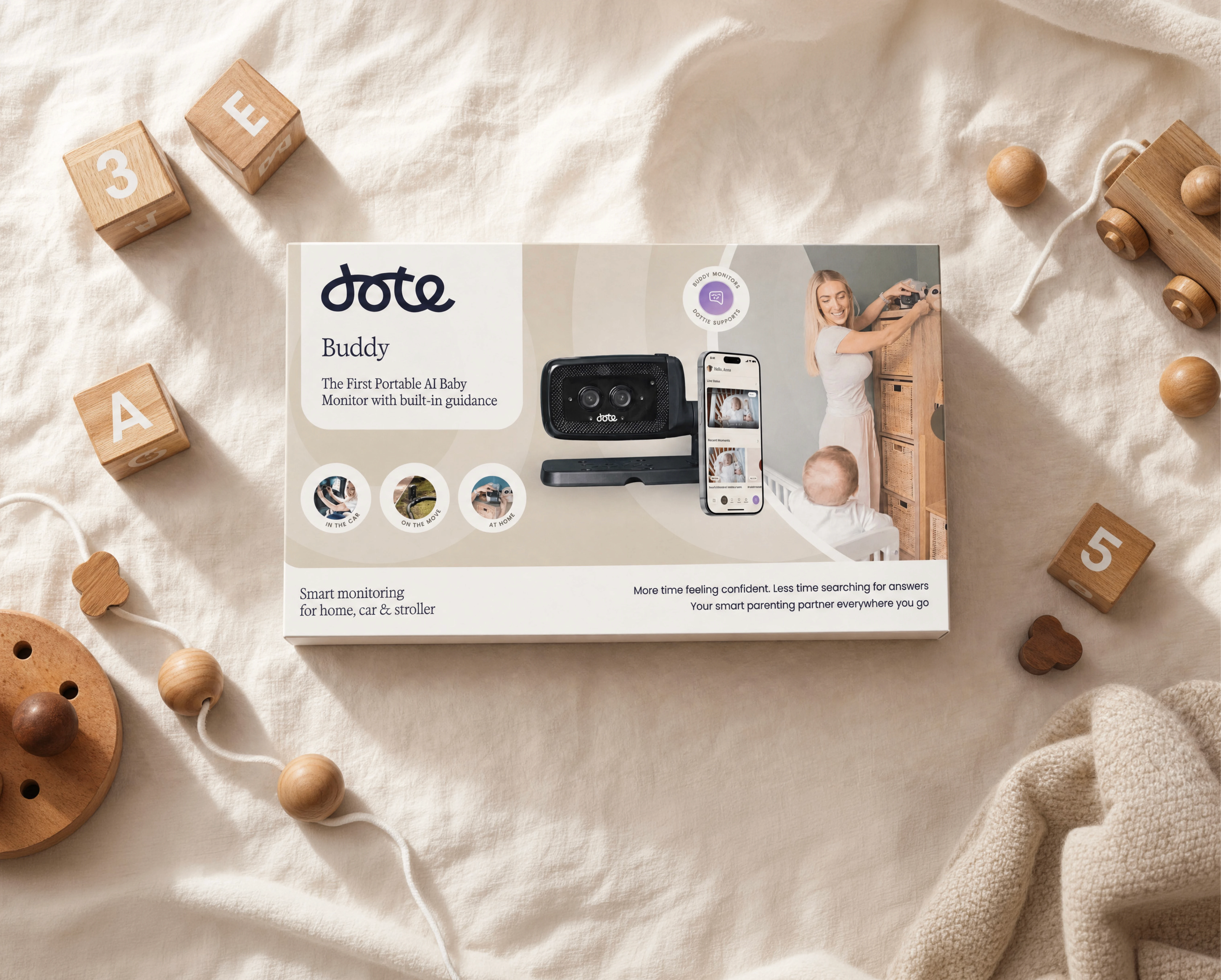
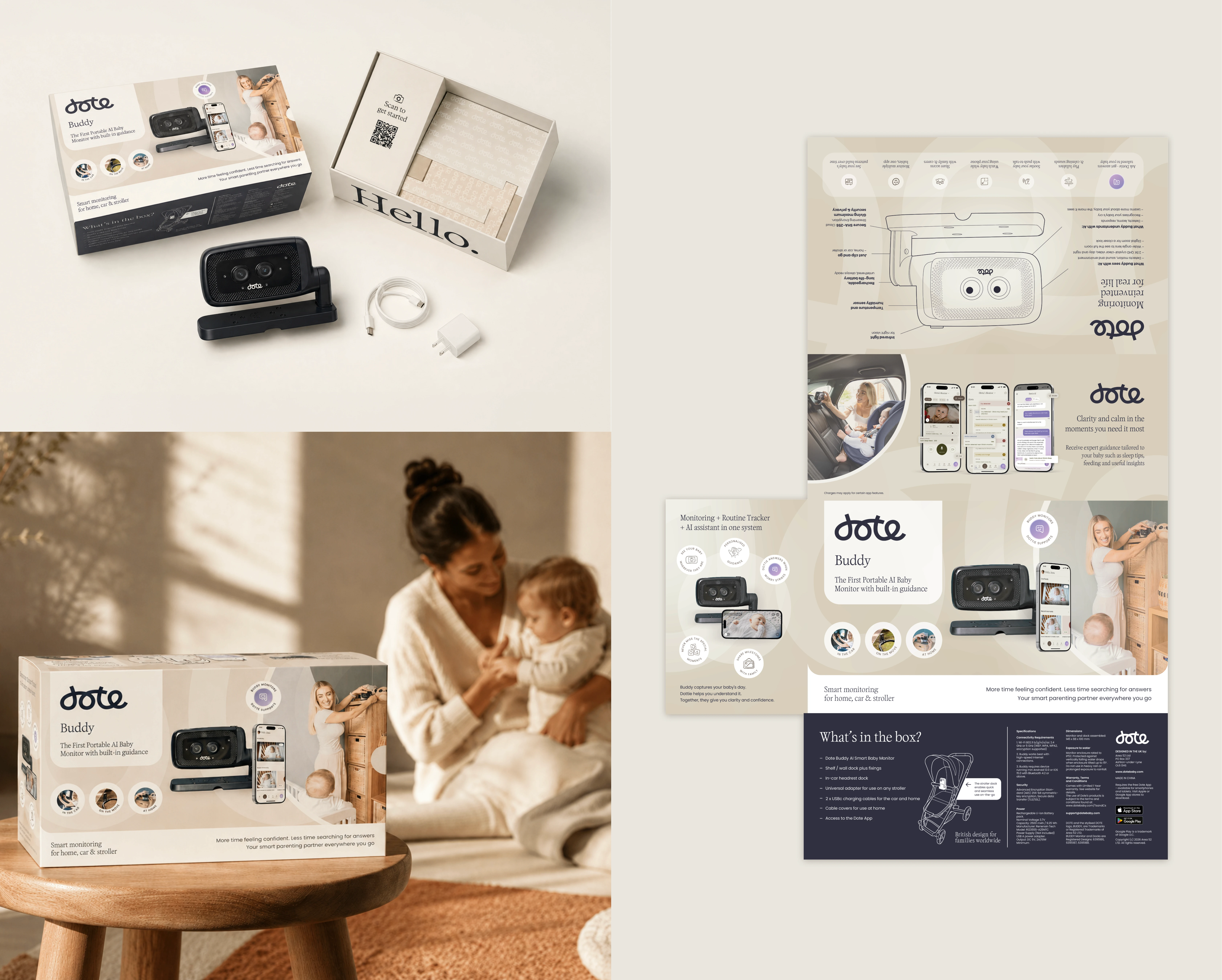
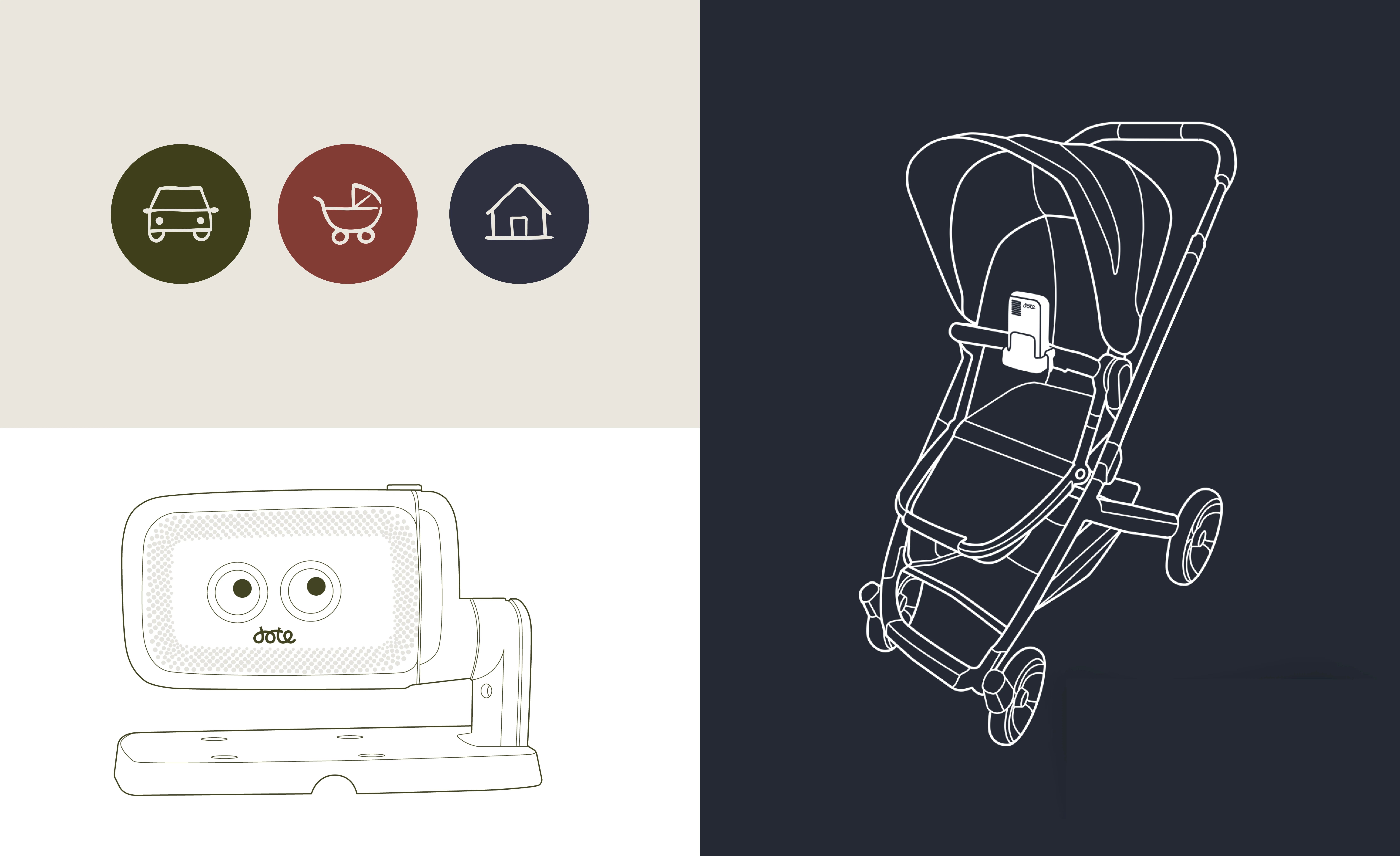
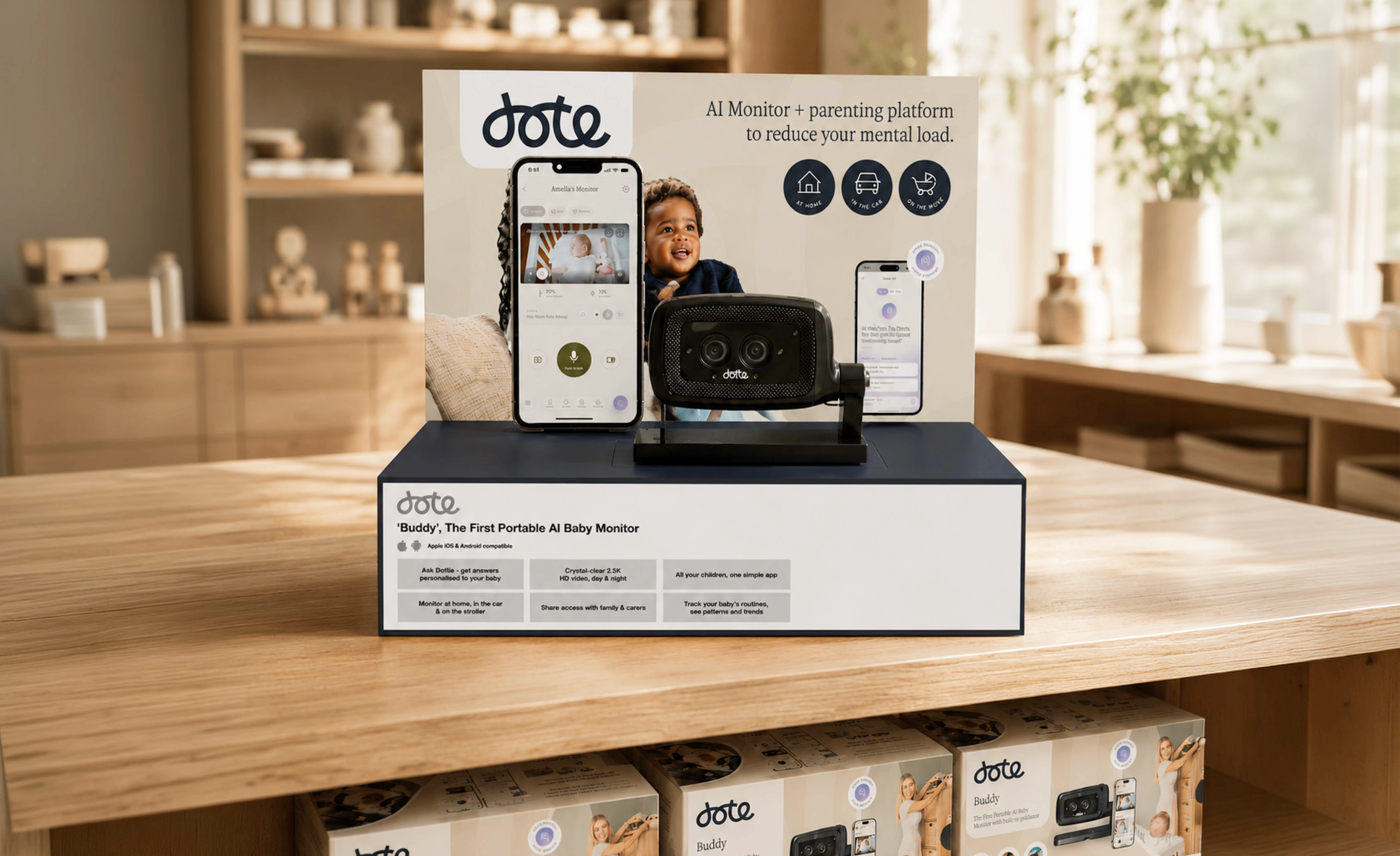
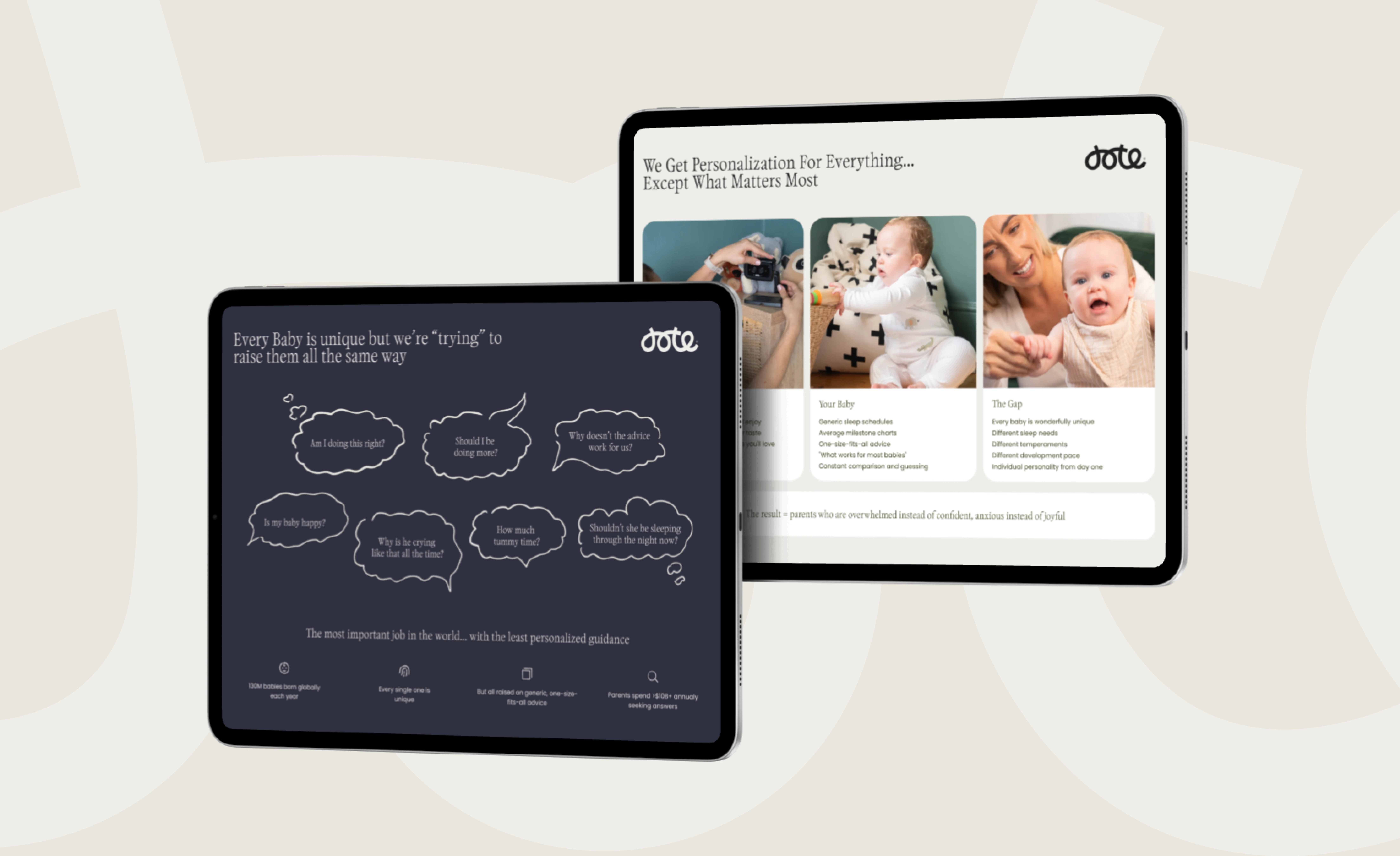
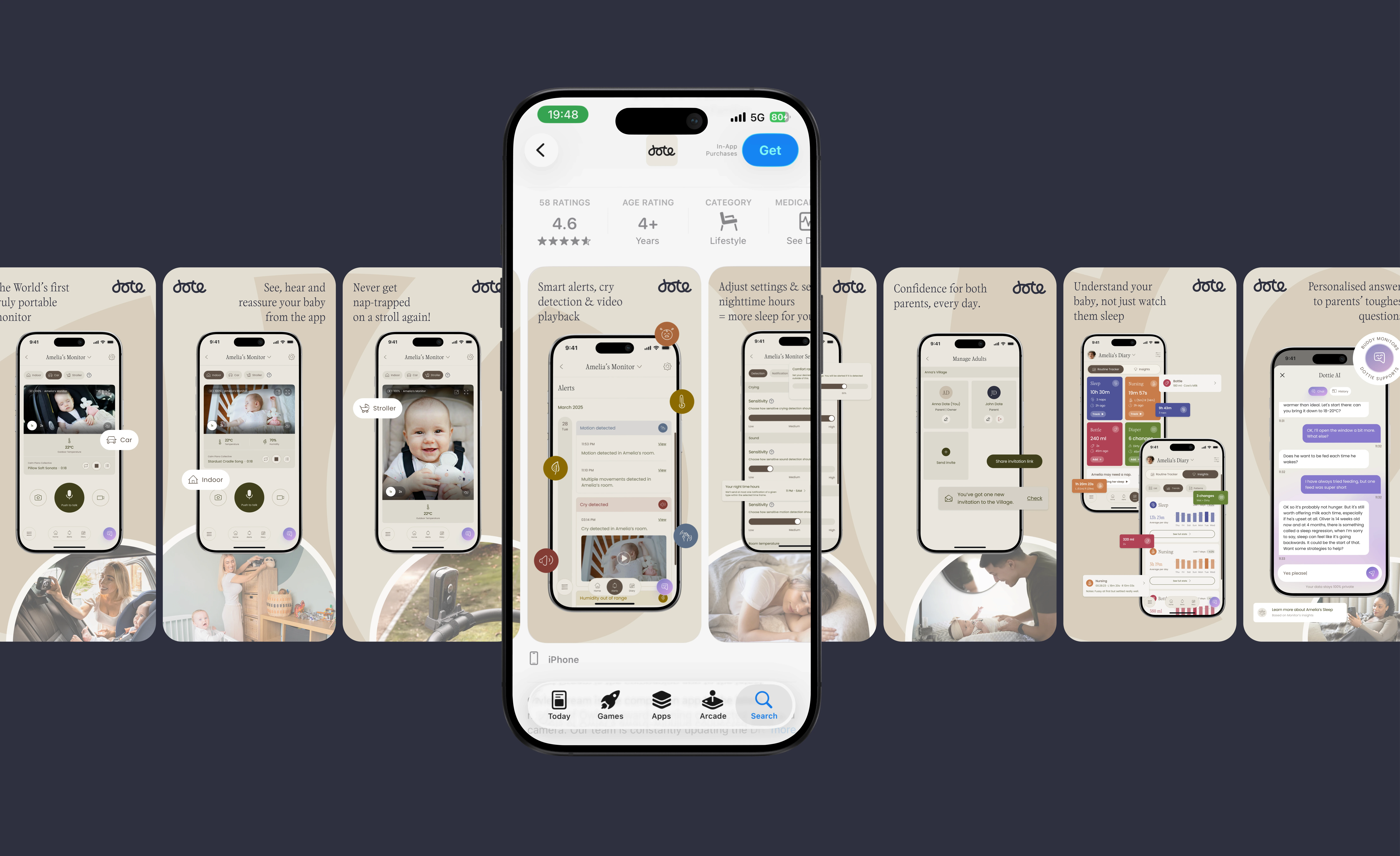
The first major piece of work was the retail packaging, designed to perform across every channel Dote was preparing to launch in. The packaging set the tone for everything that followed and effectively raised the bar for the rest of the brand to meet. From there we moved into a printed POS display for Target, designed for in-store production and finished to a standard the Dote team were really pleased with. We then developed a suite of Amazon listing graphics built around the way customers actually shop on the platform, leading with clarity and benefit rather than feature lists. Alongside the commercial work, we produced a full pitch deck for the Dote team, which gave us the opportunity to develop a much larger illustration system: more than eighty unique icons aligned to the Dote visual language, along with custom illustrations of the stroller, the Dote Buddy camera, and other product moments that the deck needed to bring to life. We also produced two live-action videos featuring AI and footages of real actors. The first frames the problem most baby monitors create and shows how Dote Buddy solves it, portable, always with you, capturing moments parents would otherwise miss when their child is with grandparents or out of the house. The second focuses on the mental load that modern parenting carries, and how Dote's AI parenting platform gives parents a way to ask, check, and reassure themselves at any point in the day. To complete the picture, we designed the App Store and Google Play artwork so that the product's first impression in the stores carried the same care as everything else. Across all of this, the illustration work became a defining thread, high in volume, consistent in style, and an extension of the brand guidelines into territory they had not previously covered.
"When I took on the role as CEO for Dote, we had a plentiful supply of creative agencies wanting to work with us. What set Overfunded apart was that they listened, they understood and then they did their homework. They came back with questions and did a lot of competitive research in our category. They quickly understood our business, our customers and were able to determine what was needed and where it was needed. That filled us with confidence. When you're launching a new product, the design has to do a lot of the work before a customer ever picks it up - and the packaging they designed instantly felt like it belonged on shelf next to the brands we're competing with. The same standard was carried through everything: the promoting videos, the App Store designs, the POS display design, the pitch deck and illustrations. It has a unique and consistent create theme. The brand finally looks the way the product feels. What I didn't expect was how well they integrated with Dote - it really felt like they were an extended part of the Dote team. All our partners were impressed with the outcomes. We knew quite soon that we wanted them to do much more for Dote. We got them involved in our software - a complex data intelligence platform for parents - guiding us from architectural strategy through design to delivery, working shoulder to shoulder with our in-house developers and CTO. Honestly, what makes Overfunded stand out from other agencies I've worked with is how passionate they are about what they do. Every detail is considered, and that's rarer than it should be. They're more than an agency - they have become part of our team and they are a pure pleasure to work with!! If you want a world-class outcome, and people who'll give their whole heart to it, I couldn't recommend them enough."
Avril Murphy
CEO @ Dote